|
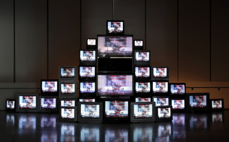
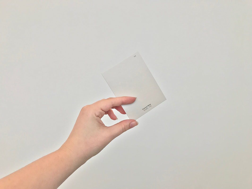
I visited the ICA (for the first time!) with the intent of picking up a plant as part of the Monumental Care project where the plants used in Provocations: Rashid Johnson are given away to be cared for by the public. Unfortunately, they ran out of tickets a half hour before I got there, so I visited the Great Force exhibition, plantless. Swear It Closed, Closes It surprised me when I read the label information. From its appearance, the arch with geometric metal pieces joined together, it seemed very scientific to me, like the molecular geometry of a protein with side chains and all that. Imagine my surprise when I found out these were prison tables joined to comment on the prison-industrial complex. There's an atmosphere of reverence to it that I think comes from the arch shape, since I've visited so many monuments like the Arch of Constantine and Arc de Triomphe. However, I thought that the feeling of sterility and coldness was very effectively conveyed by the clean metal surfaces of the tables. Colonial White was interesting in that it was sourced entirely from the public, so it really showed what individual interpretation can add to a piece. Some were complex, clearly backed by some knowledge of history and social awareness, while others were simpler, a observation from daily life. It also varied in the photographs themselves. I could tell some went to the effort of making their photo aesthetically pleasing, taking care with the composition, focus, everything, while others were functional with the intent of capturing the card, the related object, and that's it. The way the TV's were arranged reminded me of an altar and conveyed the same imposing, unwelcoming atmosphere. The music and its duplication reminded me of a church choir. It was oddly religious to me and quickly became overwhelming as the music and flashing screens seemed to engulf the dark room. I think my experience with Swear It Closed, Closes It and participants' interpretation of Colonial White are important because of the emphasis on perceptive and interpretation, which is an aspect of the content I think I'm committing to. I don't know how I'd do this, but the confrontational, imposing experience of installation is something I'd like to recreate, but in the context of my content.
0 Comments
I went to Home Depot and bought sheets of plywood and had them cut. Then I sanded them, primed them with housepaint, and sanded again. I finished sketching them and I'm ready to paint starting next studio day.
This project is a portfolio piece since I don't have any landscape or building exteriors in my portfolio. It's of a picture I took of the drum tower in Xi'an when I was there a year and a half ago. I plan to use ink wash and ink, so I got a relatively heavy but still smooth paper. It has more tooth than bristol paper. I've finished sketching entirely and I'm ready to start with ink wash.
Initially I wanted to work on a mirror surface, but I had trouble finding what kind of surface would be easy to mount, since glass is difficult to display. So I'm pocketing that idea for later and executing a play page I did in my sketchbook. I'm not sure what the content will be since it originated as a play page, but it carries the same motif of eyes and vision as my summer projects.
"see for yourself"The viewer is invited to understand the confusion with which I try to manipulate and interpret my own appearance. Each pair of glasses is a different prescription, alluding to the many perspectives with which people perceive an individual's appearance. "what do I look like, how do I know?"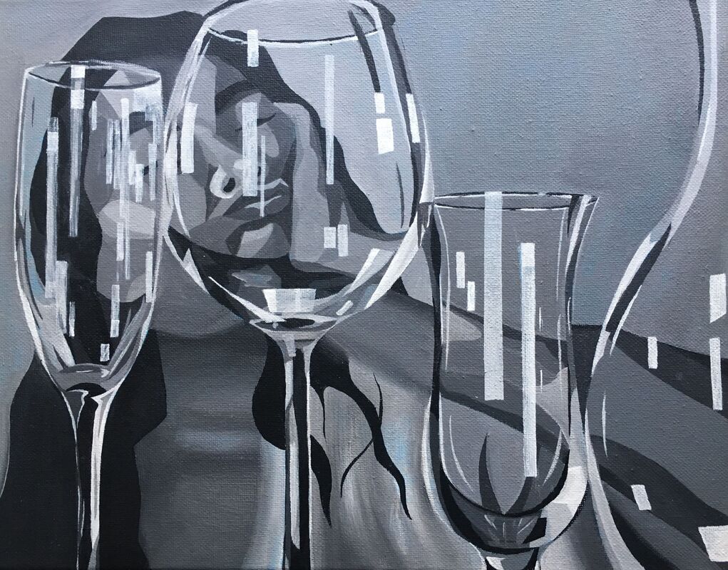 My self-image is uncertain, as I'm no longer certain in my ability to judge and value my own appearance, so it is clarified through the perspective of others. However, no one judgement is accurate, and each distorts reality in its own manner.
I affixed the drawing to a canvas so I could attach the eyehooks to the frame. Then I used thread to tie glasses together and create an overlay for the canvas. It took a bit to figure this part out, and I experimented with wire but it was too difficult to work with. I chose to leave half of the piece uncovered with the intention to provide the viewer with an opportunity to see the raw drawing, and I thought this would be more interesting than covering the entire canvas. So I changed the subject of my painting. While I was in Europe I had a long time to thing about the idea, and it didn't feel as connected to my first piece as I wanted it to be. The subject of the painting is inspired by the first piece, following the motif of distortion through glass. The blue is leftover from when I toned the canvas for the first idea I had, and because acrylic is opaque I didn't feel the need to paint over it.
For my first project about self-image and perception, I finished the pen and ink drawing which will be displayed under the layer of glasses. I chose this style because I think the lines, especially straight lines, will make the distortion of the glasses more emphatic and visible. Each mini-portrait is based off of a picture I took of myself doing a step of my makeup because it is one of the daily rituals I experience where I am directly faced with my image, where I must confront myself in order to be able to alter myself. I guess so was this process of drawing myself four times. On my painting I've bought the canvas and toned it an almost cyan blue. The image I've selected to paint is a plate of typical Costa Rican food. I found it compelling because of its simplicity and the idea that many people's first impression of a culture is their cuisine. I'm on vacation in Europe now though, so everything will have to be put on pause until I return.
I know what media I want to use- pen and ink and oil paint. I've gone to Michael's and stocked up on a palette of oil paints roughly based off of Mrs. Mosley's introduction from class. Unfortunately, no store in a 20 mile radius has Gamsol, so I bought a bottle of Liquin. After some research, I found that it's pretty toxic, but! apparently it allows brushstrokes to pretty much disappear, which I'm always a fan of. Love smoothness and well-blended paint. Pen and ink has always been my favorite medium, so now's a good chance to do something a bit more ambitious maybe. One of my head pieces was based on identity and how I perceive myself, and I want to expand on that idea. I want to do a self-portrait, and create an overlay with eyeglasses. I don't know why, but I have a bin of eyeglasses in my house. The overlay would warp the underlying self-portrait and communicate a message about an issue I deal with- a distorted self-image.
I toned my canvas a red-orange because of the blue of the duck and I really like how it's visible where the grisaille is more translucent and where I've left the orange around the edges. I didn't like the brunaille because of how hard it was to work with. It was very thin and rough, so I don't know how much more helpful it was than the sketch. I like the grisaille a lot more because of how much more precise I can be in details and in values. Overall, I really like how smooth oil paint can be because it's blendable for so long compared to acrylic, and I took home my supplies to try and finish the grisaille so at least I'd have a black and white painting.
|