|
The concept of Japanese aesthetics had already been familiar to me because of the unit in Art II where we explored the raku firing process with tea bowls. I knew about wabi-sabi as it applied to the Japanese tea ceremony, but I was surprised at how many aspects of Japanese life wabi, sabi, and yugen encompass. For example, I was surprised to learn that the presentation of rice held the beauty associated with sabi. But when she explained that the white pearls of rice gleaming against the black lacquer rice bowl and curling steam created a sense of mono no aware, it seemed like she was giving us a new perspective with which to interpret mundane aspects of life. I found it astounding that with these principles, the Japanese are able to see beauty and appreciate their surroundings in ways the West likely wouldn’t. I admire the graphic style of Japanese woodblock prints and the use of motifs and gradients. I work often in ink, so I would like to incorporate an emphasis on color rather than form in my art. The flatness of a woodblock print leads me, as a viewer, to focus more on choice of color, intent, and how color is manipulated. Towards the end of the lecture, Adams began speaking on Noh and Kabuki theater and how the Japanese aesthetic was incorporated into its performance and how actors are presented. For example, plays are performed in traditional stage settings without electricity and by actors in traditional carved masks and kimonos. However, she mentioned that Noh is more embraced as exemplifying the Japanese aesthetic because full body paint isn’t used, so the complexion of the actors can be seen in glimpses through the hands and behind the mask. This led me to become curious on how Noh masks are made and what specific role they play, so I found this short film by National Geographic.
1 Comment
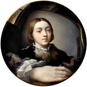
Full Name: Girolamo Francesco Maria Mazzola Parmigianino is a nickname meaning "the little one from Parma"
https://www.artble.com/artists/parmigianino https://www.wga.hu/html_m/p/parmigia/1/v_jerome.html Resources to Review and Consider for QuestionsA summary of Mannerism https://www.nga.gov/features/slideshows/mannerism.html First page only, don't need to follow the tour A overview of Parmigianino's life and his artistic influences https://www.artble.com/artists/parmigianino An analysis of "Self-Portrait in a Convex Mirror" and its significance https://www.artble.com/artists/parmigianino/paintings/self-portrait_in_a_convex_mirror Skip to section titled "Self-portrait in a Convex Mirror Artist" A video on his piece, "Madonna of the Long Neck" analyzing its stylistic techniques Questions1. How does Parmigianino's work manipulate Renaissance ideals and techniques to establish the beginnings of Mannerism?
2. In what ways did his work reject the principles of the Renaissance and in what ways does it exhibit its influence? 3. How did his work in printmaking contribute to the expansion of his artistic career? I finally finished it! It's been about a month in the making now. I ended up using acrylic paint in the background to make parts of it matte, but it wasn't very effective. The areas I used it in are just more black and you can't see as much of the color of the Yes! paste. I'm tired of having sticky fingers.
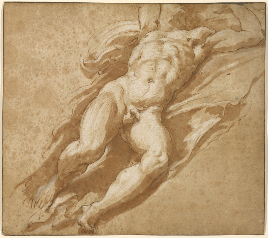
 I stayed after school so I went in for an hour and continued transferring the image. Mrs. Mosley and I had another discussion about toning the paper, and we came to the conclusion that I would be toning the paper. Toning, even though it's more intimidating, is probably closer to the process Parmigianino followed and would take less time, a pretty influential factor considering how limited studio time is. I think I'll still do a fairly light wash, not exactly a midtone but a little lighter since the original drawing doesn't have many subtle shifts between shades. I'm now just sketching on major shapes from the fabric and shadows along the legs, so I should be toning soon.
This originally was an idea I had as a play page in my sketchbook in September. I ended up doing a planning page for it to sketch out what I envisioned for the composition. It was then that I realized it couldn't be confined in a single sketchbook page, so I chose to do it on a larger separate sheet of paper. When I started this I thought it would take about two days: one to sketch out the portraits and trace them each with wire and another to attach everything. As of right now it's been on and off for about three weeks, so it's definitely a larger project than I thought it would be. I wouldn't say it's much of a play page anymore, but more of a long term experiment. The Yes! Paste is mostly why it's taken so long. Because each portrait is a continuous piece of wire and I wanted them interlocked where they overlap, when I was attaching each I'd somewhat deconstruct the portrait, attach them to the paper with paste, and then while it was still setting, I'd reshape. The Yes! Paste would then take a couple of days to set entirely and hold the wire, and I did each portrait section by section. I'd attach a certain area every few days and wait. In the meantime, I inked each of the sketches of the portraits I traced. I wasn't planning to do anything further with them, but the wire portion was slow-moving. As of right now both of the portraits are completely attached. I don't consider it finished though. I'd like to manipulate the texture of the background and add a bit of red wire accenting. The texture of the background is all from the Yes! Paste when I spread it with a palette knife or when the wire shifted and moved the paste around. It's all glossy, but I'd like to make sections of it matte again.
Today I continued transferring the image using the grid I had set on the paper the previous class. The pencil lines are faint and difficult to see in the photo, but that's because I'm using ink wash afterwards. I can't erase pencil from under ink wash as I could pen, so everything is faint and should disappear into the wash. Originally, I planned to tone the paper to the sepia shade of the original, but I decided not to with the advice of Mrs. Mosley. This was mostly because we decided ink wash had about the same effect as toning (with watercolor) but in individual patches, and upon closer inspection of the original, it seemed the highlights were both the white of the paper and white gouache. The extreme use of foreshortening makes it difficult to transfer since it never looks q u i t e right without any indication of form, but hopefully that will resolve as I progress.
|