|
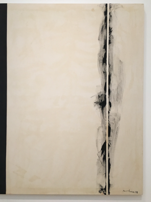
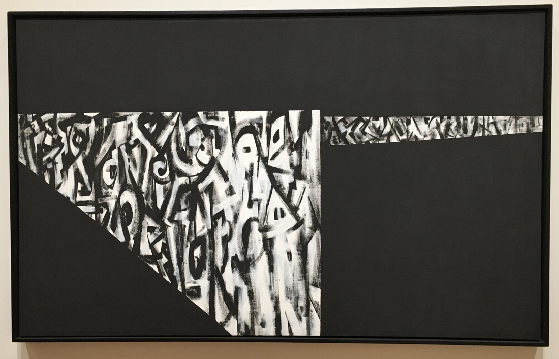
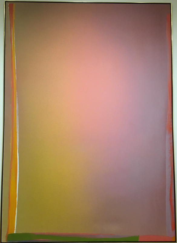
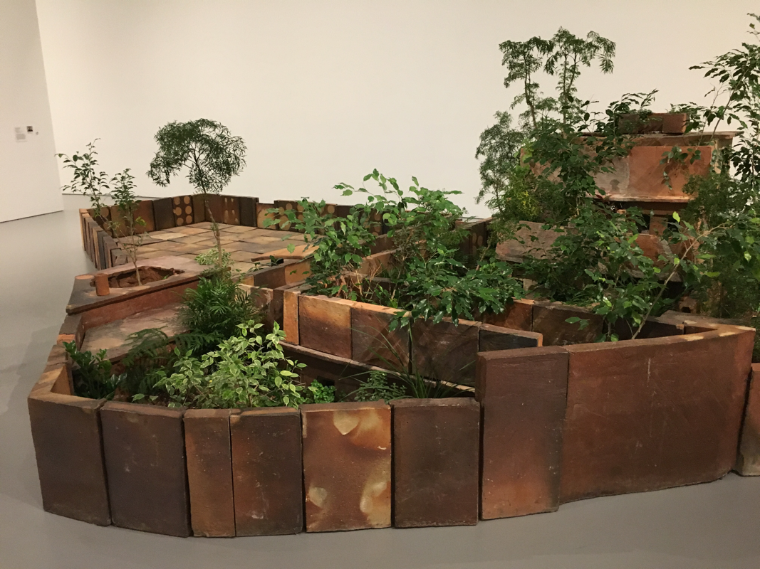
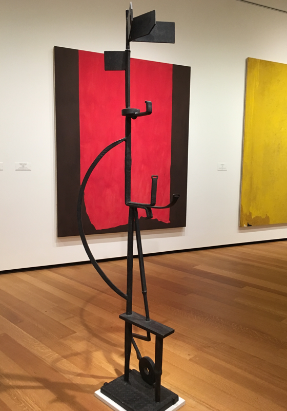
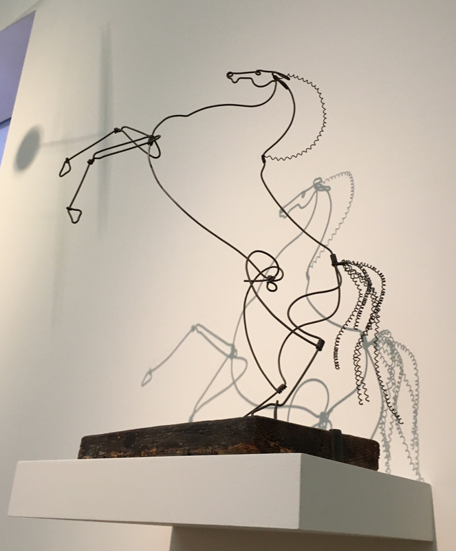
Untitled (Alabama) by Norman Lewis has distinct sections where marks interact with background. Because the lines are so distinct, it almost appeared as if he first sectioned off the shapes which would provide the white background for the mark-making. The black appears to be a consistent and smooth application as the color is consistent and there is no obvious texture or marks. In the white sections, it appeared as if Lewis painted the black figures in and then followed with dry-brushing of black paint over the white to create layers over the white. In Pink Alert by Jules Olitski, the color gradient was probably established first. There are no obvious marks in the gradient itself and the tradition is smooth, so it appears to have been heavily blended. Afterwards, the marks encompassing the gradient were painted in layers of strokes of different colors, and on some edges, the color of the gradient was brushed back over to create an overlap between the gradient and the borders. The Stations of the Cross by Barnett Newman has a background consisting of various shades of white and mark-making occurs over it, so the background was likely established first through applied layers. Tape was likely used to create the smooth border the black strip has, and it appears to have been a smooth and even application as there are no visible signs of color variation or texture. The white stripe surrounded by black gestural strokes likely was made by brushing over tape and peeling it afterwards. Both Untitled (Alabama) and The Stations of the Cross rely on mark-making and subtle variation rather than color because they are entirely in black and white. In contrast, Pink Alert is heavily based on color and has less of a focus on gestural marks. Untitled (Alabama) and The Stations of the Cross both showed evidence of intentional and careful layering between black and white. I expected the work of Norman Lewis to have consistent characteristics in appearance because of his work at the VMFA and themes surrounding racism and prejudice. I was surprised to discover that Newman’s series The Stations of the Cross had a religious background as the name implies. Compared to the religiously themed works of the Renaissance, I would not have expected these to be religiously themed. I am curious to whether Newman’s use of different shades of white was an intentional choice or if like Franz Kline, he used whatever was conveniently at his disposal. For my Abstract Expressionism painting I’d like to emulate the process of Newman because I would like to focus on the relationship between gestural and subtle marks, emphasizing this by removing color. Abbottabad by Huang Yong Ping I was interested in because of its incorporation of live plants. When I read the explanation of the work, I was surprised to learn the international connection this piece formed between a Chinese activist and the killing of Osama Bin Laden. The interaction between the terracotta and the live plants appealed visually to me and I found myself walking around the piece and stooping down to look closer at the terracotta itself. I liked how each tile was unique in its coloring as well as its shape, constructing the compound in Pakistan but in a more natural state. I think this really well emphasize his themes of life and growth. I’m interested in botanical art and some of my sketchbook pages show this, but I haven’t attempted art using live plants. If I had the resources and space I’d love to make an installation like this with my houseplants. David Smith’s Abstract Expressionist sculpture, Sentinel I, caught my attention because of its composition and the way the curves interacted with basic edges. I found it interesting that the sculpture was made of steel as it usually is thought of more as a construction material than a fine arts material. Its regality and position in the center of the room made it almost reflect its name, Sentinel I. Most of my play pages have been completely two-dimensional but I’d like to explore the balance of space more in my play pages. Rearing Stallion by Alexander Calder I liked because of how he used the wire to add texture. In the mane and tail of the stallion, he loops the wire to contrast it from the smooth lines of the body. His wire sculptures capture the movement of the stallion well and I found it interesting how it was mounted above eye-level so the shadows became part of the installation. In quarter 1 a few of my play pages also used wire, but I didn’t experiment with texture and remained largely in two dimensions.
1 Comment
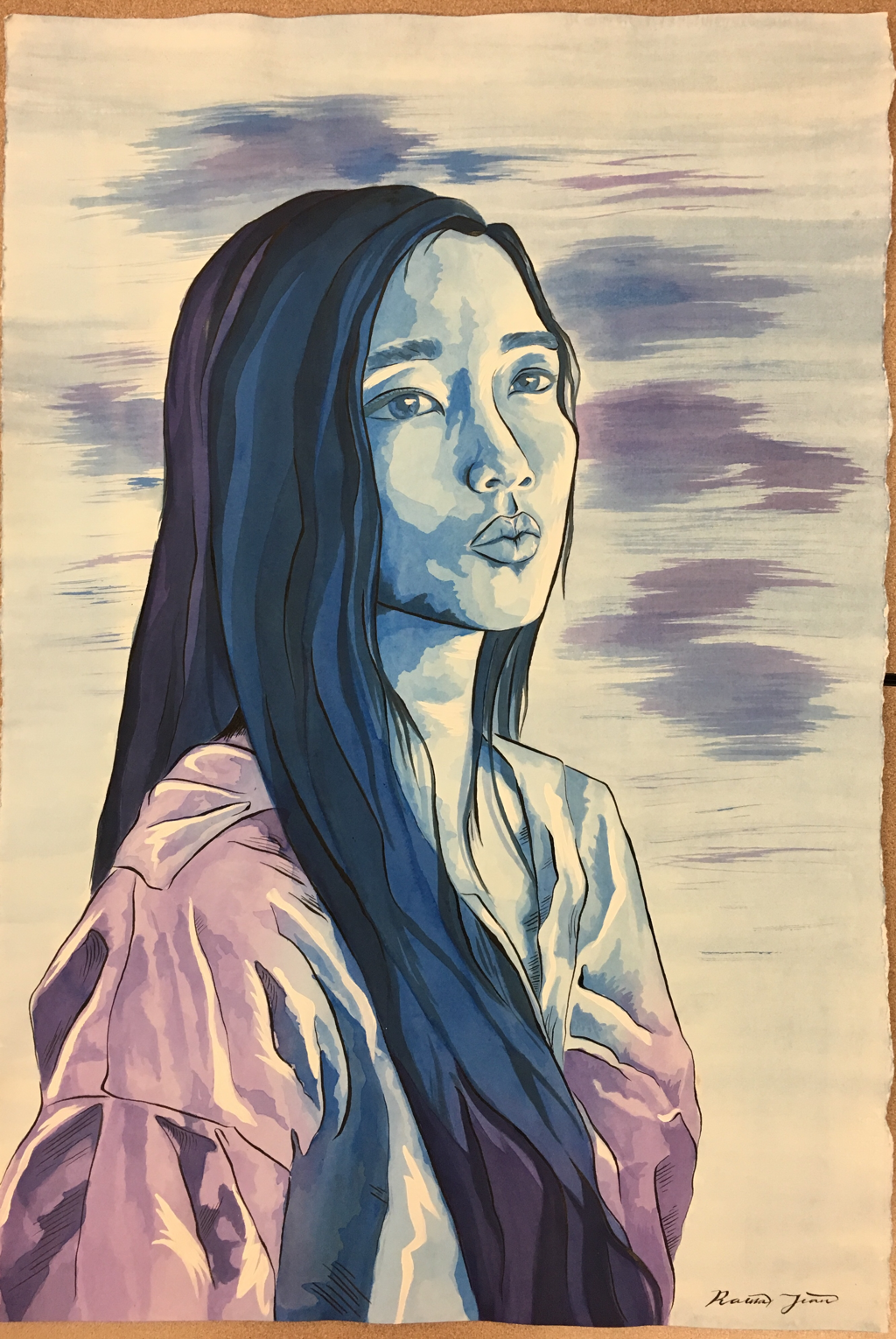
I think I'm done. I worked on it Thursday night (the end of which is the last photo) and focused on the layers on my shirt. Friday night is the fifth photo and I finished my shirt and set up the gradient in my hair. The second through the fourth photo are from Saturday afternoon to Saturday night as I finished all of the wash and then added contour lines and hatching with the dip pen. I ran out of the blue ink but I found that for the contour lines the blue and black ink which I had looked exactly the same so I just switched. Michael's only sells calligraphy/drawing ink as online then deliver orders which is really strange so I kind of didn't have a choice anyways. The dip pen dropped a really large drop on the back of my neck area (which I did last) so that's why it's really dark hatching (to somewhat mask it). This morning all I had left to do was add white highlights with the acrylic paint. The ones on my shirt are the most obvious but there's some on my face and neck as well. I'm a little disappointed since it didn't turn out how I thought it would but I'm glad I got it finished on time.
Today I finished my face and neck completely and I laid down the first two layers of my shirt. I’m saving the hair for last since I don’t know how I plan to do that yet. It’s going a lot more quickly than the old master’s copy and faster than I thought it would. I think it’s because I don’t have to actively work to copy something already exists. I’m bringing it to school tomorrow so I can rip the extra edge off during lunch without ruining the deckle.
I finally started on my home project yesterday. I sketched the figure and some shapes of major shadows yesterday, so today I toned. It’s a light blue that isn’t quite a midtone but a little lighter. The grid I didn’t really need after I sketched the shadows so I went and rolled it out with a kneaded eraser.
|