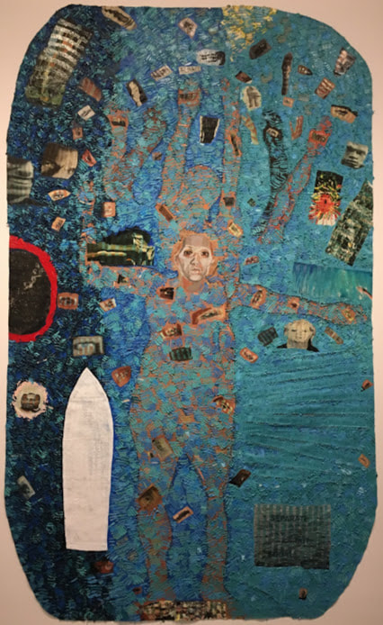
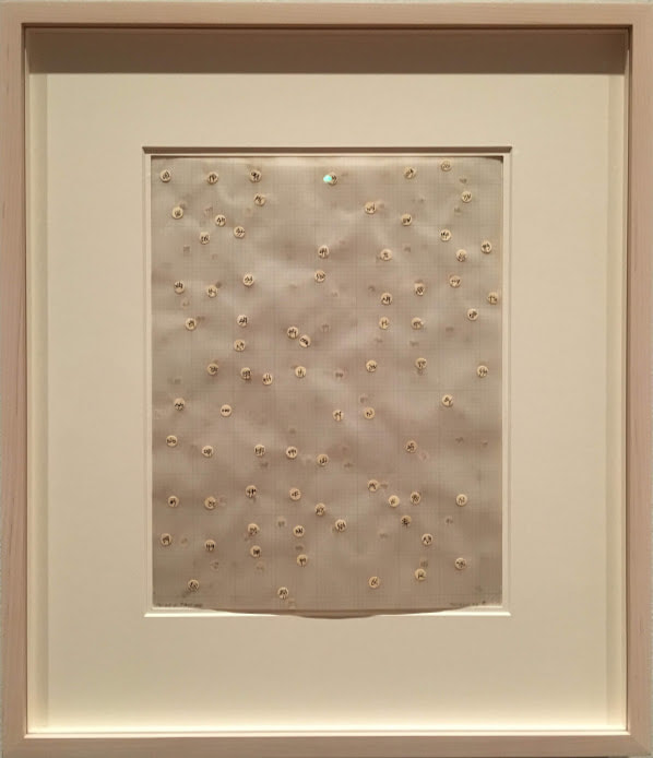
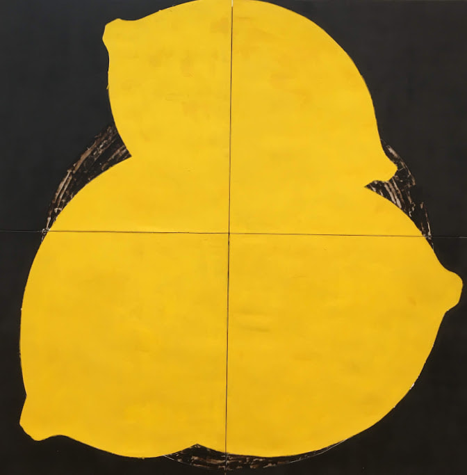
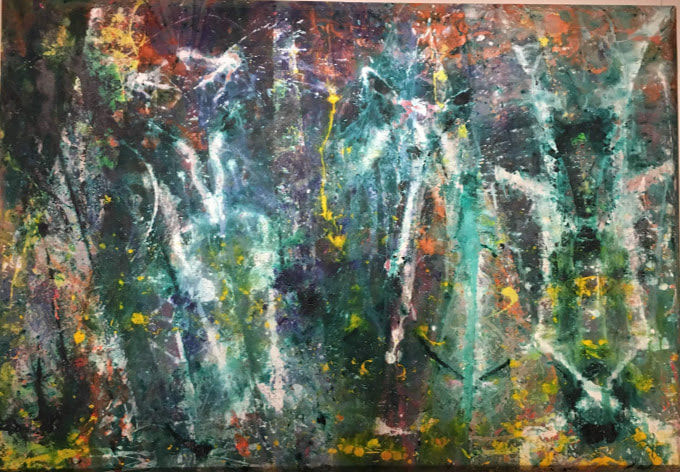
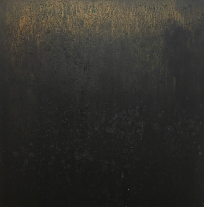
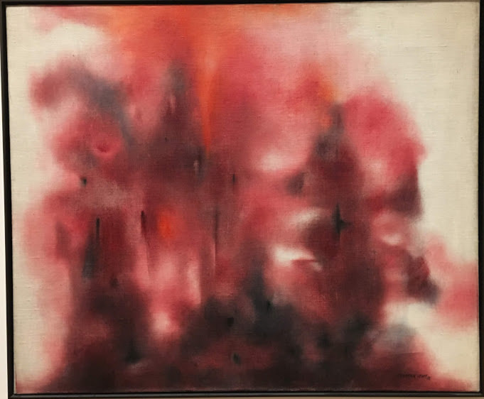
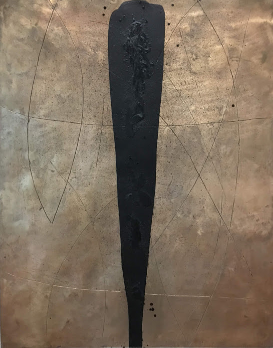
Howardena Pindell: What Remains to Be SeenThe gallery is arranged in chronological order, which I found useful in seeing the progression and development of Pindell’s work. For example, in her piece Space Frame, one of the earlier explorations in abstraction and mark-making, she utilized a distinct grid. This motif continues throughout her development as an artist. Later in the exhibit and Pindell’s life, in her piece Untitled, one of her first unstretched canvas works, the grid becomes a faint underpainting, and even later, the grid is created through her process of cutting canvases and suturing them back together. I followed the exhibit from the beginning of her artistic career to present day, so the arrangement emphasized the continuity in her works but also periods of experimentation. Pindell takes great influence from her experience of African culture and contemporary abstract artists, but she is also a product of her times and circumstances. As a black woman in the 1960s and 1970s, she was challenged and had to be extremely resourceful and hardworking to make her presence known in spaces where she usually wasn’t welcome. The timeline of her life in the exhibit is accompanied by a timeline of contemporary events. Together, they emphasize a climate marked by strife and change internationally, the challenging of norms, and an era of political and social development in America. It puts into context what Pindell experienced as she developed her voice in art as an activist. Her unstretched canvas pieces change as you walk back and forth in front of them, closer and farther away, and I found myself moving around each piece to experience this. Because they aren’t stretched, they have folds and ridges that add literal dimension to the work. Glitter and sequins catch the light differently as you change positions, so there’s always something to catch your eye. The unique texture of Pindell’s pieces provides visual stimulation, but as I looked at them, I could imagine what it must feel like to run my fingers over it. Some of her pieces also incorporated perfume, so I could imagine that when it was first exhibited, it must have also been fragrant, creating a multisensory experience. Her use of chads reminds me of a sketchbook assignment I did in Art II, so it’s interesting to know someone formally uses them as a medium. Her piece Numbered hole punches caught my eye in particular because in creating it, she allowed for her process and byproducts to become a piece of art as well. Because of this, it feels to me that in one work, she embodies the multiple previous works. Her numbering of each chad also adds the artists presence through handwriting rather than more indirectly through her mark-making. (And how did the VMFA set it up?) Later in life, Howardena Pindell was involved in a car accident, and her Autobiography series sought to document her experience and recovery from the trauma. The first of the series, Autobiography: Earth (Eyes, Injuries) shocked me. I looked at the piece before I read the credit and description, but after I read what the piece represented and how, it felt like I was hit by raw emotion when I looked at the piece again. I couldn’t help but think how well the process she developed of cutting, suturing, and collaging translated when she sought to document a human experience. Pindell communicates not only her own suffering, but the suffering of others in current events and historically. For example, she connects herself to the slave trade of the 19th century as well as the Civil Rights Movement in her piece Autobiography: Water. The piece documents the injustice suffering by African-Americans through history through heavy symbolism and phrases which summarize the attitude of the times. This piece in particular led me to realize her work would not had been what it become had she lived in a different time and emphasized “experience” as a means of inspiration. Pindell’s body of work constantly evolves as she continues in her artistic career, and this is shown through the exhibit’s method of displaying her works of one theme with its companions. It distinguishes her interests and what she explored through a physical means and emphasizes the temporal separation. My favorite piece in the exhibit was Parabia Test #4 because of the way she used the translucent vellum to create layers to the chads and separate them in space but united each layer with a continuous grid. Abstract ExpressionismWork that I deem abstract originated from a real-life object, person, place, etc. which was then manipulated by the artist in their interpretation which can vary depending in intent and medium. Non-objective work doesn't aim to portray something which physically exists but instead intangible themes or aesthetic value. The work Lemons I would deem abstract because it is the artist's interpretation of real life objects, lemons, while Born Again I would label non-objective because the artist did not intend to convey a physical entity in creating it. 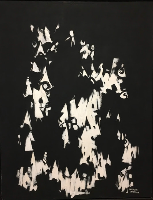 Post Mortem; Norman Lewis; 1964; Oil on Canvas Abstract Expressionism was characterized by abstract figures which represented experiences and emotions which characterized humanity. It utilized rough, visible brushstrokes as well as Surrealist influence. Post Mortem falls under Abstract Expressionism because Lewis utilized rough brushstrokes to create abstract forms to express his themes of social justice and oppression experienced in the 1960s. Born Again appears to have used a very active and bold process which left much of the mark-making up to chance. This contrasts with the process of Airline which appears very deliberate in placement and weight of marks. Magic Night appears to be a combination of these two processes as it utilized paint drips, so some of the mark-making process was left to chance. However, the subtle gradient and carefully placed gold and black detailing indicates that there was still a lot of deliberate and planned mark-making involved. Born Again appears to have used a process of action painting: fast, involved, and somewhat random placement with the intention of getting paint onto the canvas. The arcs of color suggest that the paint was projected at the canvas, and some drips suggest the canvas was laid flat and paint was allowed to drip onto it. Airline's smooth, carefully curved lines suggest a must slower, deliberate process. The black contour lines appear to have been made through etching in the bronze and the texture of the black mark in the middle seems to be wax carefully dripped over the initial black soap. The texture of the bronze was likely made when it was cast. Magic Night appears to be largely paint drips against a subtle gradient while the canvas was vertical. Some details may have been added when the canvas was flat, leading to more controlled drips, and rough blending was utilzied in the abckground. Lewis's Roseate Mist continues his portrayal of oppression and injustice. The work itself appears abrupt and violent due to its dramatic use of reds and black. It has a spontaneous appearance that when combined with the striking color choice, creates a harsh experience for the viewer. This likely parallels the strong emotion Lewis associates with his topic and evokes a similar reaction in the viewer. In Airline, the focal point is the dark, heavy black mark in the center, and the other black marks seem to be placed in response to it. It draws attention to the center of the piece and invites the viewer to follow the mark throughout the piece. It has a similar effect to an arrow and leads the viewers eyes. Magic Night relies on subtle details and gradation rather than a strong focal point. The paint drips, pulled by gravity downwards, lead the viewer's eyes from the gold paint downwards, following the path of the drips. Rather than color, it focuses on texture and requires close observation from the viewer. The viewer is encouraged to view the piece as it was formed, from top to bottom. Bonus: Artist Spotlight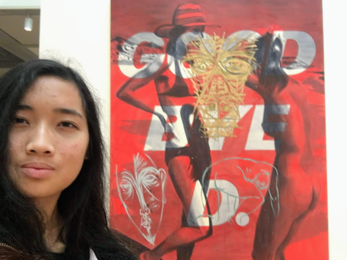 David Salle, Goodbye D., 1982, Acrylic on Canvas
2 Comments
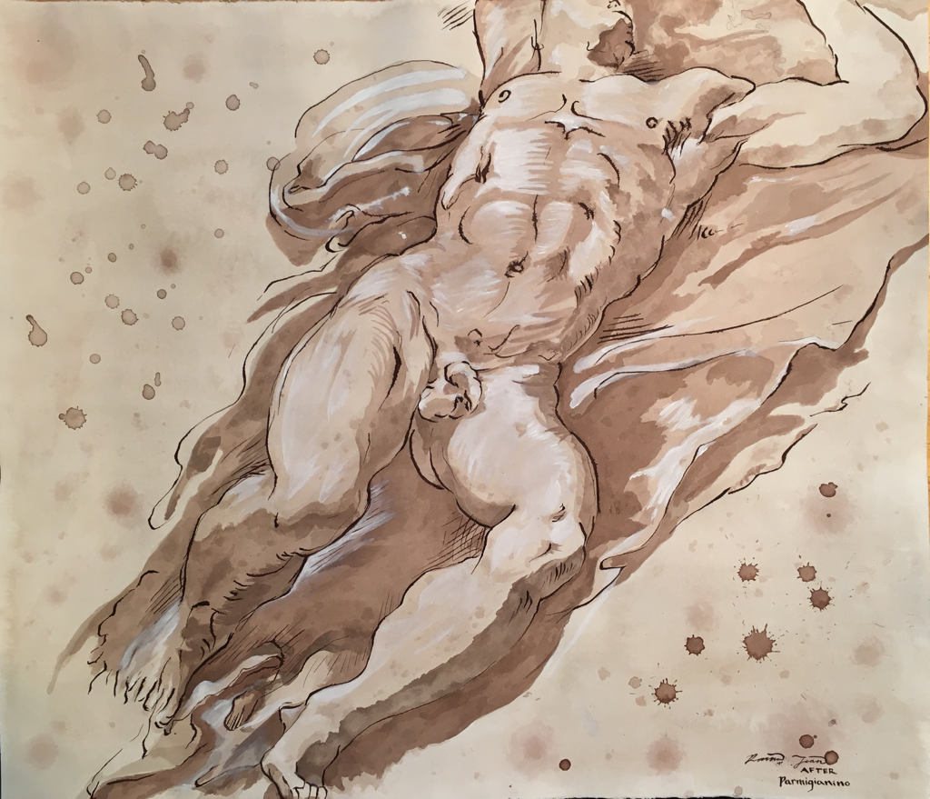  The critique yesterday didn’t turn up anything pressing to fix, so here’s the final project! Next, I’ll be matting
I took it home over Election Day to finish it throughout the day. I finished the ink wash portion completely by Monday night. Tuesday afternoon was spent first adding the contour lines and hatching in ink. It didn't bleed as much as I thought it would, and I was able to hide some of it when I added highlights. I had to wait for the ink to dry completely before I felt safe enough to add the white acrylic. The application wasn't difficult, but it was difficult to determine what was a highlight and what was the "white" of the paper. Because I watered down the acrylic paint a little to create some translucency, it ended up drying more translucent than it applied in some areas. I went over those areas again with solid white and resolved that. The only thing I added not shown in the photos is my signature in the bottom right corner.
All final marks I've made on my project have been in the last week. On Monday I finished transferring the image with pencil, and on Wednesday I toned the paper and practiced with the media on a scrap piece I had. The toning was somewhat disappointing because I thought I'd matched the shade of the paper but it got significantly lighter when it dried, so I plan to retone the negative space when I'm finished with everything else. I attempted to recreate the texture of the background but most of the drips I did settled into the tone and the darker ones separated because I used a mix of brown and black ink. They're from different brands so in another space in the top right of the paper you can also see some separation, but it's not as visible since I washed over it with solid brown ink. Otherwise, no other separation has happened. On Friday I started using ink wash and I did the fabric around the body first, thinking it would be easier to work in a defined negative space and it was easier to see the shapes of the wash on the body once I did. There's a pretty big gap in progress shots since I didn't have my phone Friday, but the 5th image was taken at the end of Friday. Throughout all of it I've been trying to recreate the splotchy effect the wash has and it's been somewhat successful in some areas like the left calf. Everything is still vague and splotchy but I'll add the defined contour lines in ink once I'm done with the wash. I took it home over the weekend and made most of my progress Friday night and today. This weekend my goal is to finish the wash completely on the legs so Monday in class I can use the ink to add contour lines and white gouache to add highlights. I'll take it home again then if I need to and use Tuesday to finish it in time for the critique Wednesday. I don't think time will be an issue. I feel comfortable in my progress. My main struggle right now is distinguishing the "white" of the paper from the "white" of the gouache. I think I've identified most of the gouache, but in larger areas such as the thigh it's harder to tell.
|