 The Try-Me Gallery is a portion of the private collection of the Royalls’ hosted in a controlled, gallery environment. The Royalls are avid collectors of visual arts, possessing numerous pieces by Kehinde Wiley, Amy Sherrill, and the Philadelphia Wireman. Plasma Stone II by Mariko Mori is displayed at the front of the building, directly in front of the window. The piece attempts to envision what the universe looked like before the Big Bang. Layers of clear acrylic are covered in dichroic film, creating an almost holographic effect on the surface of each sculpture. The importance of the surface of the piece made the sculpture difficult to install, as damage to the surface would alter its appearance greatly. The piece refracts light and its transparency makes it seem light. In addition, the piece is elevated from the ground by a thin platform. The piece weighs an enormous amount, but its display and interaction with light gives it an apparent lift. I find it interesting how Mori drew inspiration from this piece from her interpretation of a scientific phenomenon. It’s a unique interaction between astrophysics and the imagination of an artist. The sculpture at a glance doesn’t look complex, but the process of both creating it and installing it were difficult and tedious. Another piece I enjoyed was Afterimage by Vincent Lamouroux. Inspired by derelict movie theaters, the light and aluminum sculpture is suspended from the ceiling. The geometric form and continuity appealed to me. I loved the way “frames” were interwoven with each other to create movement throughout the piece. It was displayed like a chandelier and could retract into the ceiling for more open space. It’s minimalistic, but it occupies the space completely and changes as the viewer’s perspective changes. Both Plasma Stone II and Afterimage have a transparency or hollowness to them that appeals to me. You’re able to see through both of them, and because of this, there’s a sense of lightness that comes with them. The environment becomes part of the piece and the display affects how the viewer perceives it. Maybe this can become an element in a Head and Heart piece? When I learned Try-Me was a private collection, I was curious as to what about each piece appealed to the Royalls so much that they bought and display it. It was interesting to see threads of commonality running through pieces as well as the extremely diverse body of work they’ve curated for themselves. Some of the artists represented, such as Kehinde Wiley, the Royalls discovered before he became famous for Obama’s portrait. As a result, the early works of his they bought for a few thousand dollars are worth much, much more now. They had no way of knowing he’d become famous, so it really was just the art that they saw value in. The process of selection and displaying these pieces interested me, so I found this video on what it means to be a curator.
0 Comments
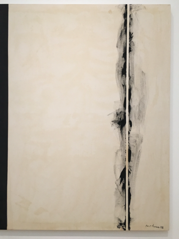
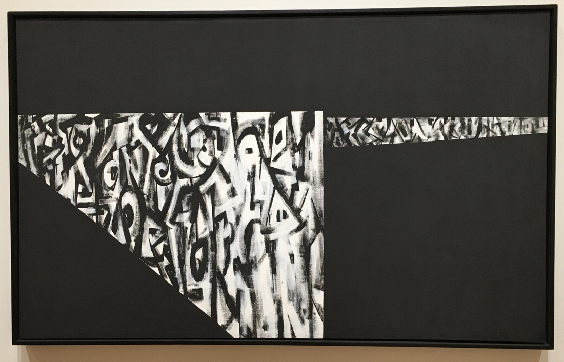
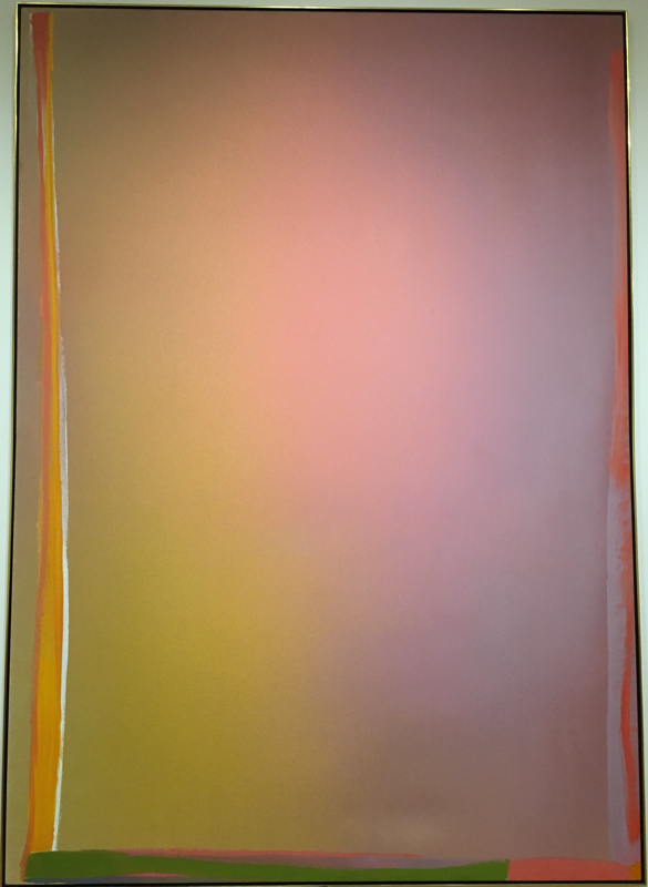
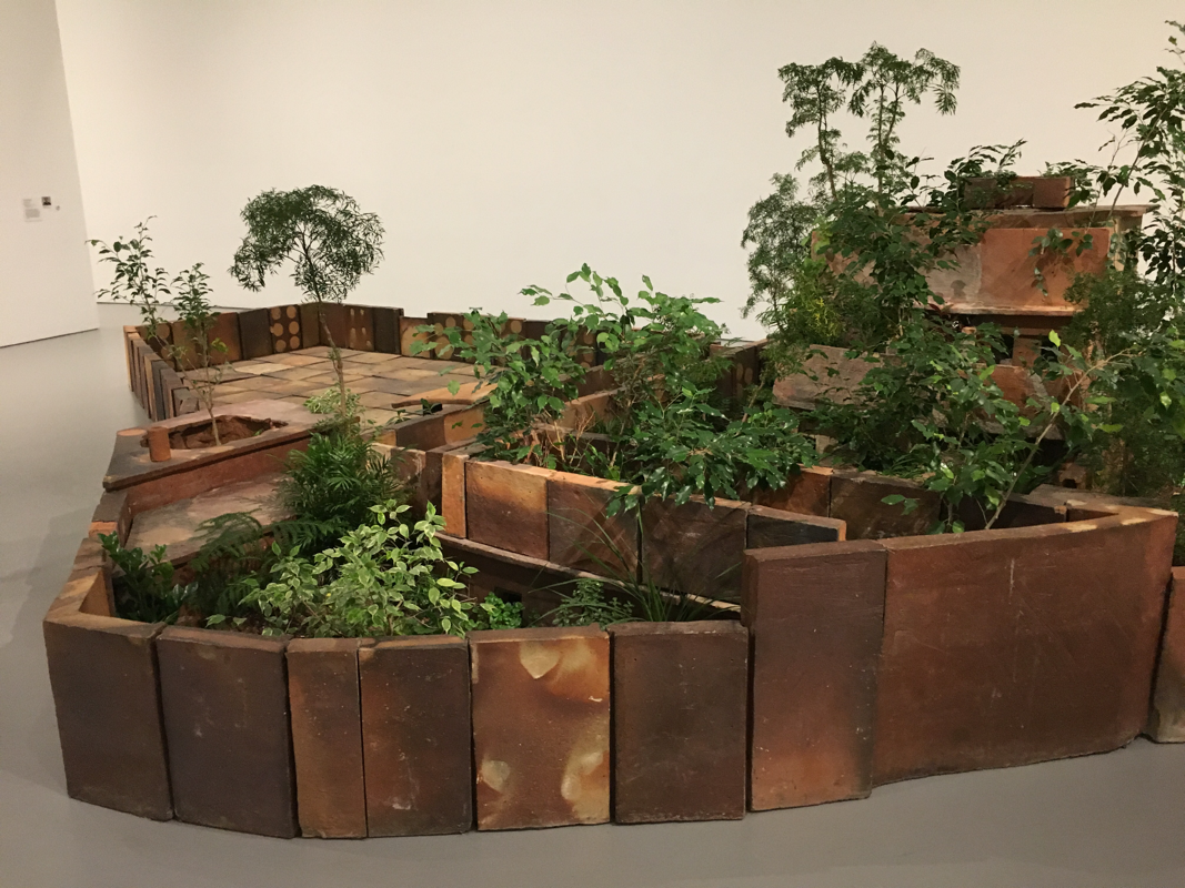
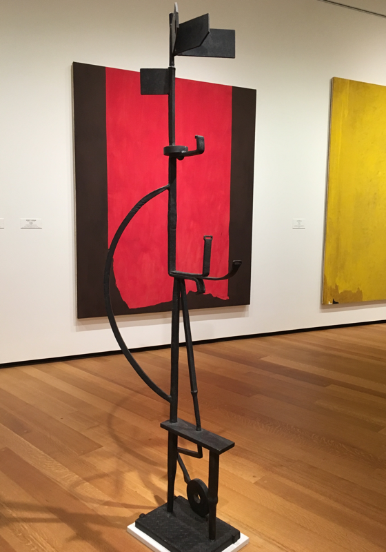
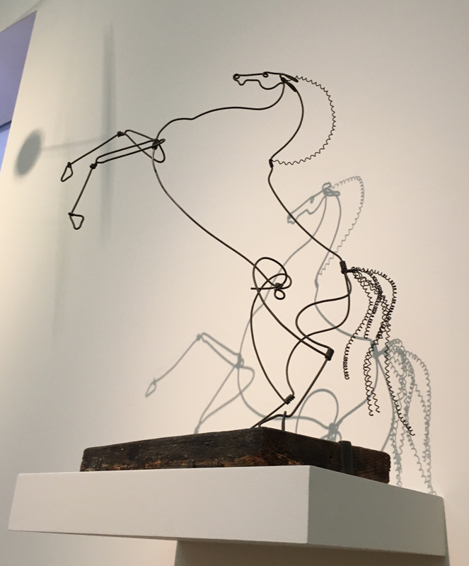
 John Freyer engages audiences in his displays of social practice art in exploring how the circulation of objects relations to the social ties between individuals and groups. His work has traveled internationally and involved different populations and communities. His work, such as Free Hot Coffee, usually advocates or brings awareness to a topic, such as recovery from substance abuse disorders. As a conceptual artist, he doesn’t have a conventional body of work. Rather, it is based on a set of ideas which he expresses through organized performances. His works are named what they are, to make as clear as possible to the public what they involve. For example, All My Life for Sale entailed selling all of his possessions on eBay and traveling around the world to meet their new owners. His series Free ____ is a suite of projects in which he offered coffee, water, and hot supper to an audience to facilitate their involvement. His community targets young people in recover from substance abuse disorders because he is able to relate to them, having been involved in recovery programs such as Rams in Recovery at VCU. I found it interesting how Freyer’s work is both rooted in his own experiences and what he believes to be the needs of the community. Free Ice Water arose because when he was in recovery, he learned to listen to the stories of others and share his own. Sensing that people seemed to lack opportunities to genuinely engage with other people for long periods of time, Free Ice Water allowed for two strangers to have a long conversation in an open environment. At recovery programs, Freyer noticed the lack of good coffee and thought he could do better. From there, he developed Recovery Roast and Free Hot Coffee. In Free Hot Coffee, people are able to participate in the creation of the blend as well as the serving of the coffee. The process of pour-over coffee is slow and deliberate, allowing for time for the recovering and their allies to share their stories with the community. The connection to my art isn’t as direct, but I admire what he does. He has benefitted from the recovery community and through his projects, he gives back to them. The idea of having an audience contribute to the work appeals to me, but I’m not sure how to incorporate it. Social practice art is art that serves a purpose and he very effectively uses it to building a network of support and awareness. Being able to make myself a cup of coffee at the end really tied the entire experience together. I found this TedX talk by Ed Woodman on his work in social practice art.  I don’t know much about photography or film-making. Nor do I do much of either, so her work didn’t have as clear connections to my own art. However, I do enjoy watching short films although most that I watch are animated or produced by large companies. I’ve always been aware of experimental films because of the televisions in galleries set up to loop a couple of films, but I’d never had the opportunity to learn about the process behind them. It was interesting to follow Sasha Waters Freyer’s progression in her artistic career and see what experiences led her to her experimental films. She began work in documentary because she enjoyed portraying people’s stories. she wanted to make her films more personal, so she switched to experimental film. Her process really seemed like a series of discoveries in what she was interested in and what she enjoyed, so the connection to play pages was pretty clear. She mentioned that what she does in film isn’t really a career path, so she works outside of making films. But I think her process and freedom to explore is partially because of this lack of outside pressure demanding quantity over quality in order to generate a living. I’ve always thought of photography as a more distant and impersonal process since the subject is filtered through a lens regardless of the artist’s manipulation, but her experiences seemed to contradict that. Especially in her film Respiration, she mentioned her tedious and meticulous process in finding old film, manipulating it, and building her own props and sets. It’s difficult to understand film as an “artistic plastic medium” as she mentioned because the camera seems so fixed and unforgiving. I was surprised at how long it takes to make an hour-long film. Working on a project for three weeks in class seems long, so I can’t imagine three years. Some of the terms she used like 16mm I didn’t quite understand but that could inspire future explorations. I was interested in her incorporation of old film, so I found this video where they develop found WWII footage. Untitled (Alabama) by Norman Lewis has distinct sections where marks interact with background. Because the lines are so distinct, it almost appeared as if he first sectioned off the shapes which would provide the white background for the mark-making. The black appears to be a consistent and smooth application as the color is consistent and there is no obvious texture or marks. In the white sections, it appeared as if Lewis painted the black figures in and then followed with dry-brushing of black paint over the white to create layers over the white. In Pink Alert by Jules Olitski, the color gradient was probably established first. There are no obvious marks in the gradient itself and the tradition is smooth, so it appears to have been heavily blended. Afterwards, the marks encompassing the gradient were painted in layers of strokes of different colors, and on some edges, the color of the gradient was brushed back over to create an overlap between the gradient and the borders. The Stations of the Cross by Barnett Newman has a background consisting of various shades of white and mark-making occurs over it, so the background was likely established first through applied layers. Tape was likely used to create the smooth border the black strip has, and it appears to have been a smooth and even application as there are no visible signs of color variation or texture. The white stripe surrounded by black gestural strokes likely was made by brushing over tape and peeling it afterwards. Both Untitled (Alabama) and The Stations of the Cross rely on mark-making and subtle variation rather than color because they are entirely in black and white. In contrast, Pink Alert is heavily based on color and has less of a focus on gestural marks. Untitled (Alabama) and The Stations of the Cross both showed evidence of intentional and careful layering between black and white. I expected the work of Norman Lewis to have consistent characteristics in appearance because of his work at the VMFA and themes surrounding racism and prejudice. I was surprised to discover that Newman’s series The Stations of the Cross had a religious background as the name implies. Compared to the religiously themed works of the Renaissance, I would not have expected these to be religiously themed. I am curious to whether Newman’s use of different shades of white was an intentional choice or if like Franz Kline, he used whatever was conveniently at his disposal. For my Abstract Expressionism painting I’d like to emulate the process of Newman because I would like to focus on the relationship between gestural and subtle marks, emphasizing this by removing color. Abbottabad by Huang Yong Ping I was interested in because of its incorporation of live plants. When I read the explanation of the work, I was surprised to learn the international connection this piece formed between a Chinese activist and the killing of Osama Bin Laden. The interaction between the terracotta and the live plants appealed visually to me and I found myself walking around the piece and stooping down to look closer at the terracotta itself. I liked how each tile was unique in its coloring as well as its shape, constructing the compound in Pakistan but in a more natural state. I think this really well emphasize his themes of life and growth. I’m interested in botanical art and some of my sketchbook pages show this, but I haven’t attempted art using live plants. If I had the resources and space I’d love to make an installation like this with my houseplants. David Smith’s Abstract Expressionist sculpture, Sentinel I, caught my attention because of its composition and the way the curves interacted with basic edges. I found it interesting that the sculpture was made of steel as it usually is thought of more as a construction material than a fine arts material. Its regality and position in the center of the room made it almost reflect its name, Sentinel I. Most of my play pages have been completely two-dimensional but I’d like to explore the balance of space more in my play pages. Rearing Stallion by Alexander Calder I liked because of how he used the wire to add texture. In the mane and tail of the stallion, he loops the wire to contrast it from the smooth lines of the body. His wire sculptures capture the movement of the stallion well and I found it interesting how it was mounted above eye-level so the shadows became part of the installation. In quarter 1 a few of my play pages also used wire, but I didn’t experiment with texture and remained largely in two dimensions.
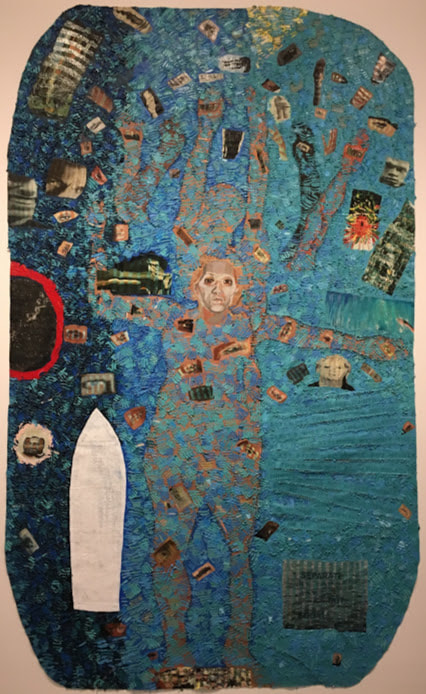
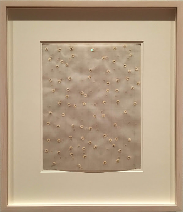
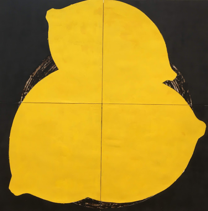
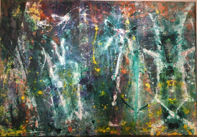
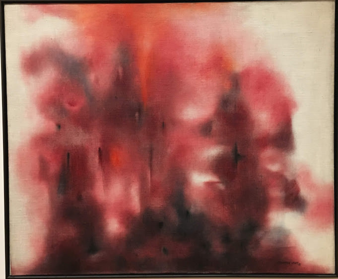
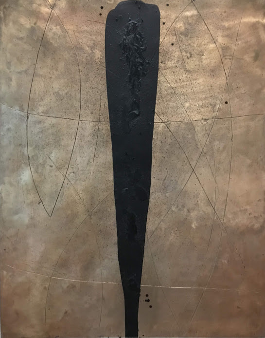
Howardena Pindell: What Remains to Be SeenThe gallery is arranged in chronological order, which I found useful in seeing the progression and development of Pindell’s work. For example, in her piece Space Frame, one of the earlier explorations in abstraction and mark-making, she utilized a distinct grid. This motif continues throughout her development as an artist. Later in the exhibit and Pindell’s life, in her piece Untitled, one of her first unstretched canvas works, the grid becomes a faint underpainting, and even later, the grid is created through her process of cutting canvases and suturing them back together. I followed the exhibit from the beginning of her artistic career to present day, so the arrangement emphasized the continuity in her works but also periods of experimentation. Pindell takes great influence from her experience of African culture and contemporary abstract artists, but she is also a product of her times and circumstances. As a black woman in the 1960s and 1970s, she was challenged and had to be extremely resourceful and hardworking to make her presence known in spaces where she usually wasn’t welcome. The timeline of her life in the exhibit is accompanied by a timeline of contemporary events. Together, they emphasize a climate marked by strife and change internationally, the challenging of norms, and an era of political and social development in America. It puts into context what Pindell experienced as she developed her voice in art as an activist. Her unstretched canvas pieces change as you walk back and forth in front of them, closer and farther away, and I found myself moving around each piece to experience this. Because they aren’t stretched, they have folds and ridges that add literal dimension to the work. Glitter and sequins catch the light differently as you change positions, so there’s always something to catch your eye. The unique texture of Pindell’s pieces provides visual stimulation, but as I looked at them, I could imagine what it must feel like to run my fingers over it. Some of her pieces also incorporated perfume, so I could imagine that when it was first exhibited, it must have also been fragrant, creating a multisensory experience. Her use of chads reminds me of a sketchbook assignment I did in Art II, so it’s interesting to know someone formally uses them as a medium. Her piece Numbered hole punches caught my eye in particular because in creating it, she allowed for her process and byproducts to become a piece of art as well. Because of this, it feels to me that in one work, she embodies the multiple previous works. Her numbering of each chad also adds the artists presence through handwriting rather than more indirectly through her mark-making. (And how did the VMFA set it up?) Later in life, Howardena Pindell was involved in a car accident, and her Autobiography series sought to document her experience and recovery from the trauma. The first of the series, Autobiography: Earth (Eyes, Injuries) shocked me. I looked at the piece before I read the credit and description, but after I read what the piece represented and how, it felt like I was hit by raw emotion when I looked at the piece again. I couldn’t help but think how well the process she developed of cutting, suturing, and collaging translated when she sought to document a human experience. Pindell communicates not only her own suffering, but the suffering of others in current events and historically. For example, she connects herself to the slave trade of the 19th century as well as the Civil Rights Movement in her piece Autobiography: Water. The piece documents the injustice suffering by African-Americans through history through heavy symbolism and phrases which summarize the attitude of the times. This piece in particular led me to realize her work would not had been what it become had she lived in a different time and emphasized “experience” as a means of inspiration. Pindell’s body of work constantly evolves as she continues in her artistic career, and this is shown through the exhibit’s method of displaying her works of one theme with its companions. It distinguishes her interests and what she explored through a physical means and emphasizes the temporal separation. My favorite piece in the exhibit was Parabia Test #4 because of the way she used the translucent vellum to create layers to the chads and separate them in space but united each layer with a continuous grid. Abstract ExpressionismWork that I deem abstract originated from a real-life object, person, place, etc. which was then manipulated by the artist in their interpretation which can vary depending in intent and medium. Non-objective work doesn't aim to portray something which physically exists but instead intangible themes or aesthetic value. The work Lemons I would deem abstract because it is the artist's interpretation of real life objects, lemons, while Born Again I would label non-objective because the artist did not intend to convey a physical entity in creating it. 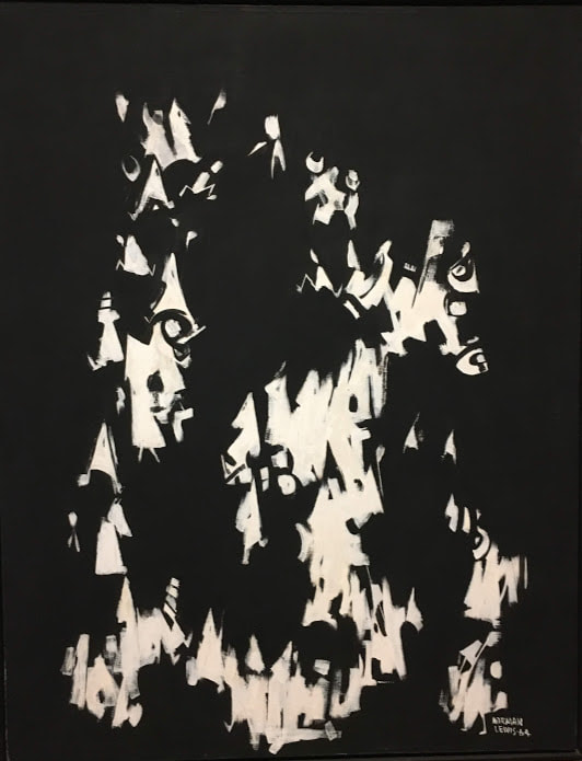 Post Mortem; Norman Lewis; 1964; Oil on Canvas Abstract Expressionism was characterized by abstract figures which represented experiences and emotions which characterized humanity. It utilized rough, visible brushstrokes as well as Surrealist influence. Post Mortem falls under Abstract Expressionism because Lewis utilized rough brushstrokes to create abstract forms to express his themes of social justice and oppression experienced in the 1960s. Born Again appears to have used a very active and bold process which left much of the mark-making up to chance. This contrasts with the process of Airline which appears very deliberate in placement and weight of marks. Magic Night appears to be a combination of these two processes as it utilized paint drips, so some of the mark-making process was left to chance. However, the subtle gradient and carefully placed gold and black detailing indicates that there was still a lot of deliberate and planned mark-making involved. Born Again appears to have used a process of action painting: fast, involved, and somewhat random placement with the intention of getting paint onto the canvas. The arcs of color suggest that the paint was projected at the canvas, and some drips suggest the canvas was laid flat and paint was allowed to drip onto it. Airline's smooth, carefully curved lines suggest a must slower, deliberate process. The black contour lines appear to have been made through etching in the bronze and the texture of the black mark in the middle seems to be wax carefully dripped over the initial black soap. The texture of the bronze was likely made when it was cast. Magic Night appears to be largely paint drips against a subtle gradient while the canvas was vertical. Some details may have been added when the canvas was flat, leading to more controlled drips, and rough blending was utilzied in the abckground. Lewis's Roseate Mist continues his portrayal of oppression and injustice. The work itself appears abrupt and violent due to its dramatic use of reds and black. It has a spontaneous appearance that when combined with the striking color choice, creates a harsh experience for the viewer. This likely parallels the strong emotion Lewis associates with his topic and evokes a similar reaction in the viewer. In Airline, the focal point is the dark, heavy black mark in the center, and the other black marks seem to be placed in response to it. It draws attention to the center of the piece and invites the viewer to follow the mark throughout the piece. It has a similar effect to an arrow and leads the viewers eyes. Magic Night relies on subtle details and gradation rather than a strong focal point. The paint drips, pulled by gravity downwards, lead the viewer's eyes from the gold paint downwards, following the path of the drips. Rather than color, it focuses on texture and requires close observation from the viewer. The viewer is encouraged to view the piece as it was formed, from top to bottom. Bonus: Artist Spotlight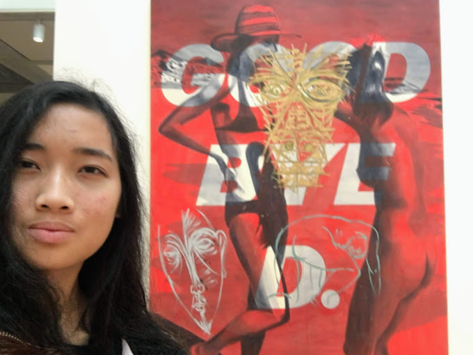 David Salle, Goodbye D., 1982, Acrylic on Canvas The concept of Japanese aesthetics had already been familiar to me because of the unit in Art II where we explored the raku firing process with tea bowls. I knew about wabi-sabi as it applied to the Japanese tea ceremony, but I was surprised at how many aspects of Japanese life wabi, sabi, and yugen encompass. For example, I was surprised to learn that the presentation of rice held the beauty associated with sabi. But when she explained that the white pearls of rice gleaming against the black lacquer rice bowl and curling steam created a sense of mono no aware, it seemed like she was giving us a new perspective with which to interpret mundane aspects of life. I found it astounding that with these principles, the Japanese are able to see beauty and appreciate their surroundings in ways the West likely wouldn’t. I admire the graphic style of Japanese woodblock prints and the use of motifs and gradients. I work often in ink, so I would like to incorporate an emphasis on color rather than form in my art. The flatness of a woodblock print leads me, as a viewer, to focus more on choice of color, intent, and how color is manipulated. Towards the end of the lecture, Adams began speaking on Noh and Kabuki theater and how the Japanese aesthetic was incorporated into its performance and how actors are presented. For example, plays are performed in traditional stage settings without electricity and by actors in traditional carved masks and kimonos. However, she mentioned that Noh is more embraced as exemplifying the Japanese aesthetic because full body paint isn’t used, so the complexion of the actors can be seen in glimpses through the hands and behind the mask. This led me to become curious on how Noh masks are made and what specific role they play, so I found this short film by National Geographic. |